Good contrast is about using colours that provide enough variation between the content and background. This is particularly important for people who have conditions that affect vision or colour perception, as well as people browsing on mobile in different light conditions.
People find it difficult to read content for many reasons:
- Colour Vision Deficiency, otherwise known as colour-blindness, means some people have difficulty recognising certain colours or any colours at all
- Ageing impacts people's ability to see colours
- Differences in device size, resolution and contrast can all affect colour quality
- Bright conditions, such as sunlight, can reduce someone's ability to see what's on the screen clearly
Another consideration is the psychological impact colours can have on some people:
- People with Autistic Spectrum Disorders can be sensitive to sensory information including very bright or high-contrasting colours
- People with Dyslexia can find text on a pure white background dazzling and difficult to read
- People with low vision can find text on a patterned or textured background difficult to read

Colour contrast ratios
A colour contrast ratio describes the colour of an object (such as text) against the colour of its background. It's written as object:background - for example 4.5:1.
In some cases, it's necessary to think about more than one contrast ratio per element. For example, the colour of a button must contrast clearly against its background, and the button's text label must also contrast well against the button's colour.


Contrast rules for text
There are two contrast requirements for text:
- Large text (at least 24px, or bold and at least 19px) should have a minimum contrast ratio of 3:1
- Small text (less than 24px, except for the bold rule outlined above) should have a minimum contrast ratio of 4.5:1
Contrast rules for graphics and user interface components
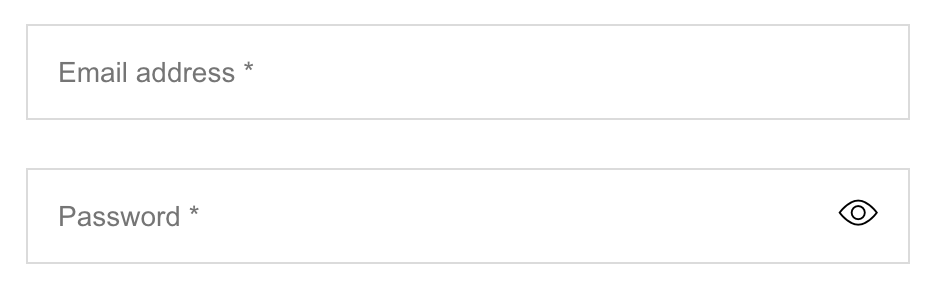
A contrast ratio of 3:1 is required for graphics containing information needed to understand the content and interactive elements. This includes form fields, links and buttons, and any visual cues that indicate their state.
Exclusions to the contrast rules
There are some types of content that don't need to meet colour contrast requirements:
- An image of text that is not essential to understanding the meaning of the content
- A decorative graphic that does not have any meaning or purpose
- Text which is part of a logo or brand identity
Tips for colour contrast
- View your content on a mobile when outside to see if it is still readable in different light conditions
- Always try and exceed the colour contrast minimum, not just meet it
Related standards
- WCAG 2.1 Success Criterion 1.4.3 Contrast (Minimum) (Level AA)
- WCAG 2.1 Success Criterion 1.4.11 Non-text Contrast (Level AA)
More information
- TPG: Colour Contrast Analyser
- NoCoffee Vision Simulator for Firefox
- W3C Perspectives: Color contrast
- #id24: Rethinking color contrast by Jared Smith
Next steps
Read more accessibility foundations posts or sign up for Accessibility Unlocked, our free six-day newsletter series designed to help you kick-start accessibility.


